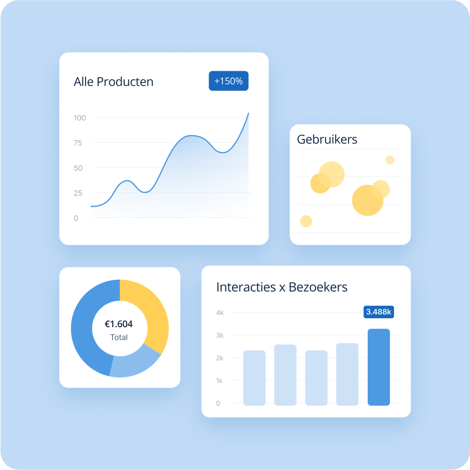
Introduction
Prisma IT builds narrowcasting software that gives businesses control over their content across every screen and location from one platform. They brought me on as graphic designer to help visualize the software's features for their new landing page.
Problem
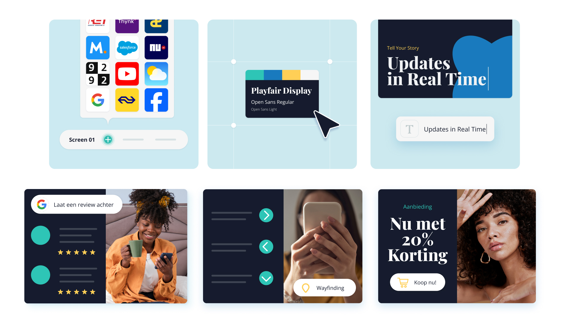
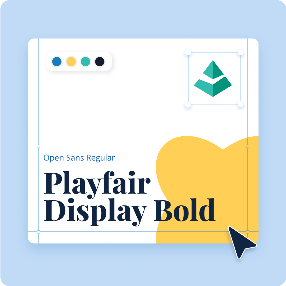
"Narrowcasting" is an unfamiliar word, and describing what the software does in text alone doesn't land the way seeing it does. Prisma needed a way to quickly show what the platform can actually do: connect screens to apps like Google Maps, weather, YouTube, or NS. Edit content within your own brand guidelines or update everything instantly across every screen.
Goal
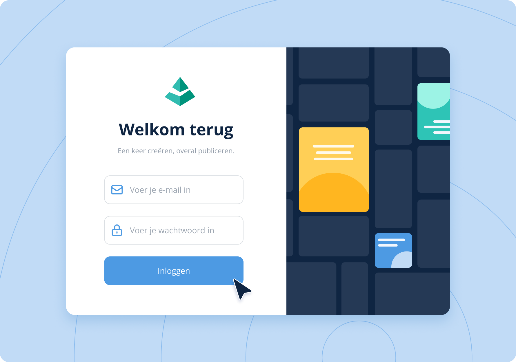
Turn each of Prisma's software capabilities into a design clear enough to explain itself. This way the page's accompanying text reinforces the idea instead of carrying it alone.
Process
Moodboard: I looked at how platforms like Typeform, Canva, and Figma explain their own features. These companies constantly have to walk new users through what their software can do. That became the reference point: clean, stylized UI that doesn't literally replicate Prisma's dashboard, but makes each feature instantly legible. Click, connect your YouTube account, done.
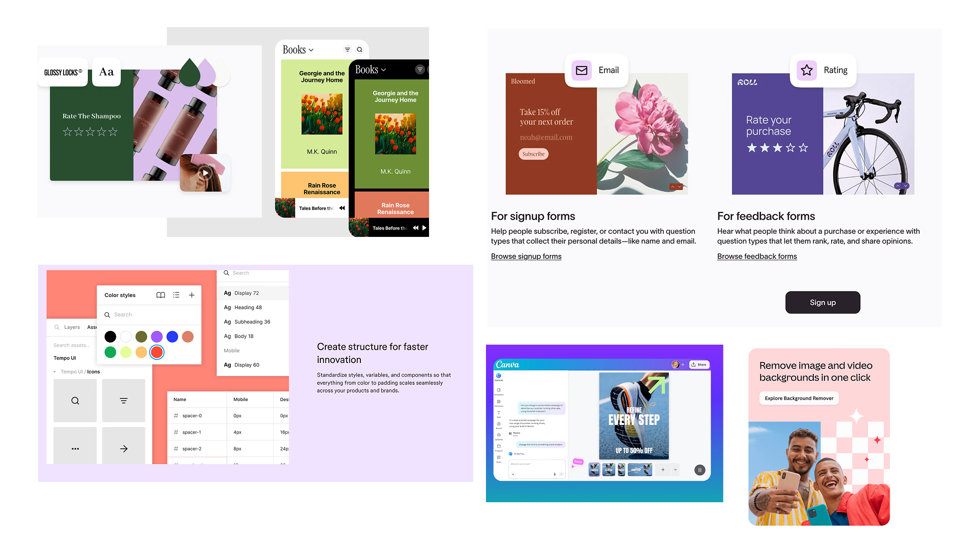
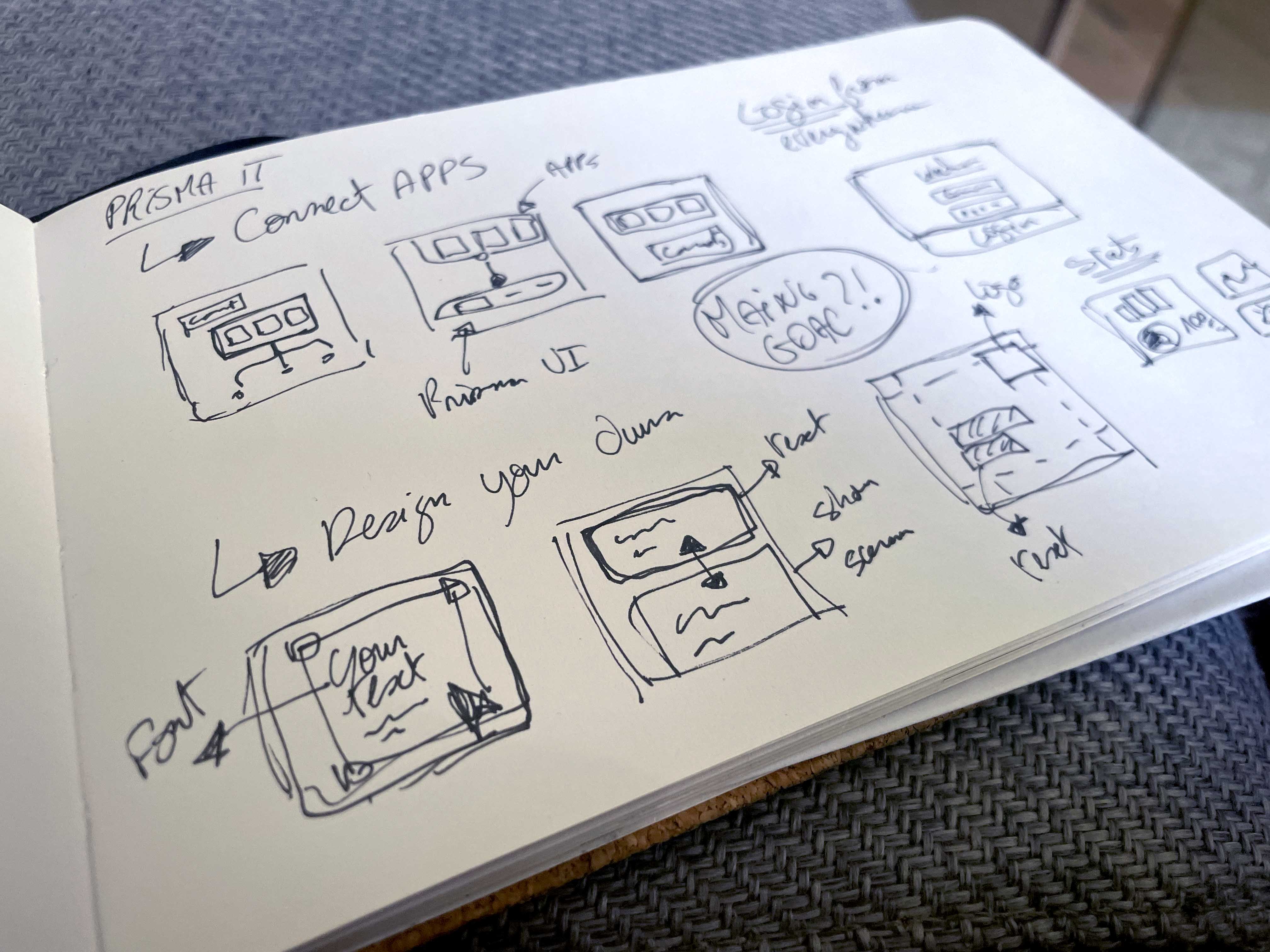
Sketch and previous versions
I sketched a handful of directions for each concept, refined them with client feedback, then designed the final set of 8 illustrations.